top of page


News Update at 30th Dec 2020
-
We wish you all a happy new year and hope you will remember to renew your membership for 2021.
-
There has been a change to our April booking which will now be a Zoom demo of portraiture in pastels from Rob Wareing.
-
There is an EXTRA too! The opportunity to paint along with NZ artist Richard Robinson on 14th Jan. Fiona Gale gives all the info you need to know HERE

NB Sorry but Mobile phone view is NOT recommended for this site. Laptop is much preferred
Otter Vale Art Society
July 2021: Watercolour demo with Jake Winkle
Jake Winkle is a well-known award-winning watercolourist who is inspired by light and movement. His paintings are a reflection of the world around him, often domestic animals or more exotic wildlife but also landscape scenes. For us Jake produced an impression of a sun-bathed Venice based on a canal view not far from the Rialto Bridge
.

This is Jake's portable watercolour box. The central hub contains Windsor&Newton watercolours in a paste freshly squeezed from the tube. Colours include cobalt blue, Windsor green, raw sienna, light red, alizarin crimson, ultramarine, Windsor violet and sepia.
Initial mixing is done in the side trays with further dilution in the top and bottom sections

Jake's reference photo. He decided to simplify the 'busy' composition, retaining the left-hand vaporetto but replacing the landing stage area with a couple of distant gondolas
He used Arches watercolour paper, 140lb, which notably absorbs water very evenly. When either stapled or taped down [essential!] this paper reduces the risk of buckling and unwanted valleys of pigment. Likewise the even absorption means that balloons and 'cauliflowers' are less of a problem.
Because Arches absorbs pigment deep into the paper, it is also easier to later add undisruptive glazes of overlay.


01th

02th

10
01th
1/9
A slideshow of the early stages.
Jake created an early evening warm glow with a wash of just water over the upper half of the paper, and then using a squirrel brush to bring a dilute wash of raw sienna up from the horizon to barely meet a wash of cobalt blue brought down from the top. In this was a clear sky was created that avoided any unwanted green mixes.
Similarly, a blush of Windsor purple and green was brought up through the canal to meet the horizon.

28

30

43
28
1/15
I [Chris] accidentally lost all screengrabs of the middle development, alas, [!] but Jake was keen to make the left buildings much darker than the right, using light red for the pantiles, cobalt blue warmed by light red for the shadowed wall, and a dark mix of ultramarine and sepia for the timbers in the shadow of the pantiles. The windows, as much else, were deliberately painted loosely [with 'sticky' paint, still thick paste, so that marks retain their shape]. He emphasizes that too much regularity and precision draws the eye in a distracting way. If everything is slightly awry it more closely approximates to our actual perception [we are not pinhole cameras!]. If the picture is deliberately a bit ragged accordingly, it often seems to work better than if everything is 'perfect'.
This slideshow of the later stages grandstands the judicious use of complementaries [yellow/purple&violet] of 'sol y sombra'. Jake uses areas of broken paintmarks, i.e. with gaps, to depict areas of broken wall, and some dry strokes to conjure the illusion of weathered stone.
As previously noted, Jake eschews too much regularity in the balustrades.
The water was darkened richly and some telling fluid reflection marks of the canal posts etc were added.
Last of all a few diagonal shadows, and two slanting flagpoles, were put in, just to add a further touch of life to the scene, and a smidge or two of white gouache [tinged with raw sienna] to add occasional highlights.

*****************************************************************************
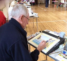
The WORKSHOP
Jake also conducted a follow-up workshop in Sidbury where some OVAS member were able to meet again in real life for the first time in well over a year of lockdowns.
The subject matter was a rendition of this same scene and members showed high levels of technical ability to emulate the master. Here are a few shots of the day


Penny L:amb's version. Not bad!!!!

bottom of page